Introduction :
In today’s digital landscape, user experience is crucial for the success of web applications. One key aspect often overlooked is the ease of inputting sensitive information, such as passwords. Traditional password fields obscure entered characters, sometimes causing frustration for users who may have mistyped. However, with Bubble.io’s versatile plugin ecosystem, enhancing this aspect of user interaction is straightforward. In this blog post, we’ll explore how to integrate the Input Password Toggler plugin into Bubble.io applications, allowing users to toggle between hiding and showing their passwords, thereby improving usability and user satisfaction.
Step-by-Step Guide to Adding Password Hide and Show Functionality
1. Add the Plugin to Your App

- Log in to Bubble.io: Start by logging into your Bubble.io account and opening the app editor.
- Navigate to Plugins: Go to the "Plugins" tab in the left sidebar.
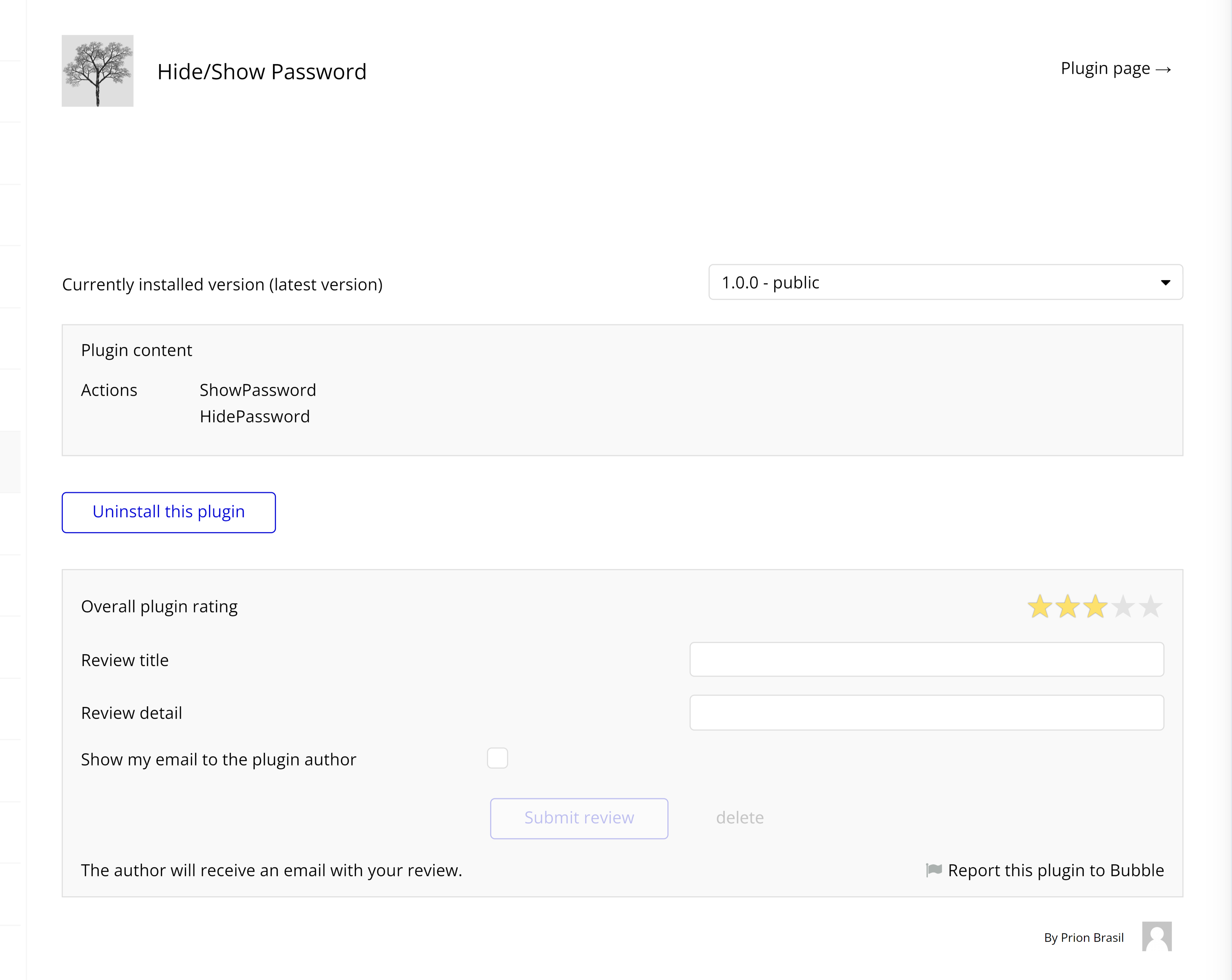
- Add Plugins: Click on "Add Plugins" and search for "Hide/Show Password" in the marketplace.
- Install the Plugin : Install the plugin to your app to get started.
2. Add an Input Element
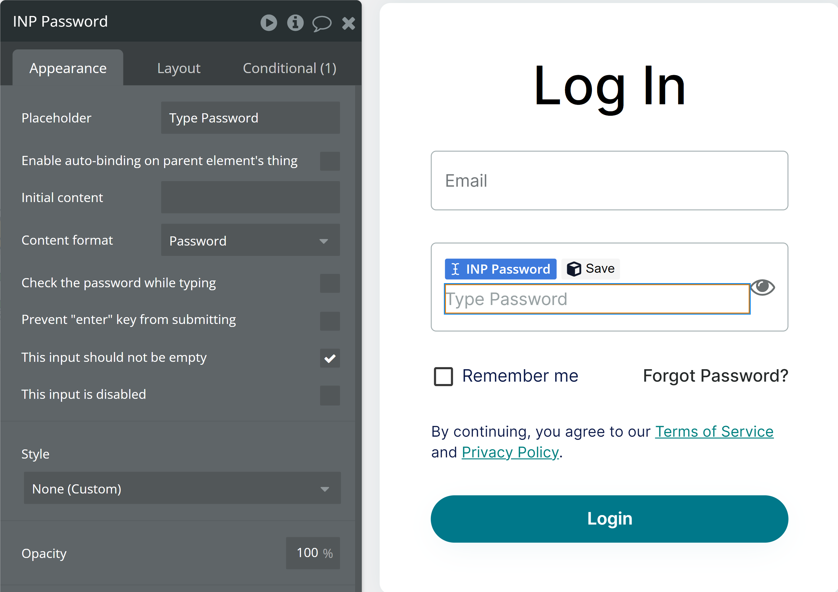
- Drag and Drop Input Element : From the toolbox, drag and drop an "Input" element onto your page where users will enter their password.
3. Set Input Type to Password

- Select Input Element : Click on the input element you just added.
- Set Input Type: In the property editor on the left side, locate the "Input type" property and set it to "Password." This ensures that the text entered by the user is hidden by default.
4. Add a Toggle Button
- Add Button Element: Drag and drop a "Button" element from the toolbox onto your page. This button will be used to toggle between showing and hiding the password.
- Create a Custom State: Click on "Create a new state" and name it "ShowPassword." Set its type to "Yes/No."
5. Create a Workflow for the Toggle Button

- Select Toggle Button: Click on the toggle button you added.
- Navigate to Workflow Tab: Go to the "Workflow" tab in the property editor.
- New Workflow for Click Event: Create a new workflow for the "Click" event of the button.
- Modify Custom State: In the workflow editor, add an action to modify the custom state "ShowPassword." Set its type to "Yes/No."

- Set Input ID Attribute: Assign an ID Attribute to the password input field.
- Update Workflow: Add a second step in the workflow to handle the input value toggle for Hide/Show.
6. Conditional Formatting for Input Element

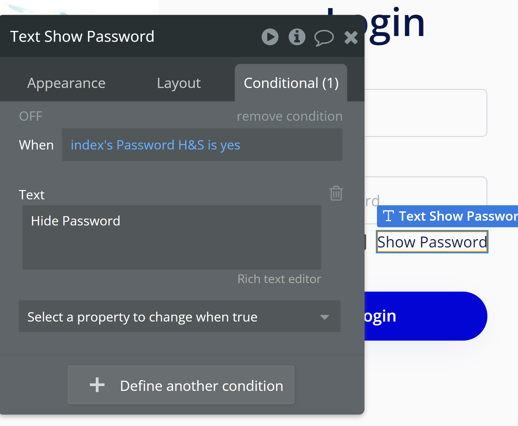
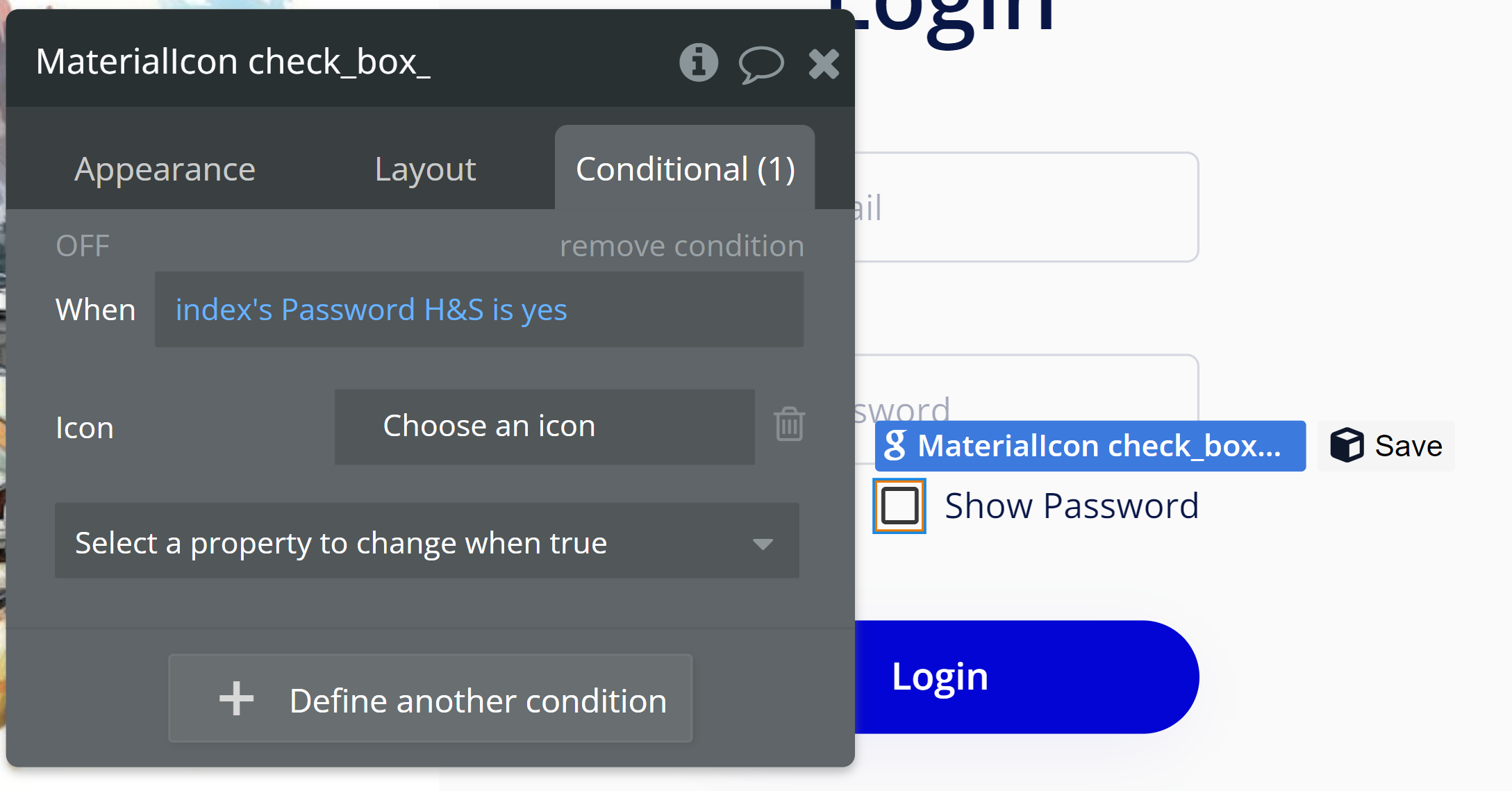
- Select Icon and Text Element: Click on the icon and text element.
- Conditional Tab: Go to the "Conditional" tab in the property editor.

- Create New Condition: Set the condition based on the value of the custom state "ShowPassword."
- Toggle Text: If "ShowPassword" is yes, change the text to "Hide Password"; otherwise, set it to "Show Password."
- Set Icon: Adjust the icon to show "Checked" when the password is visible and "Unchecked" when hidden.
7. Test Your Implementation
- Preview Your App: Click the "Preview" button.
- Test Functionality: Enter a password in the input field and click the toggle button. Ensure you can switch between showing and hiding the password.
Conclusion
Incorporating password hide and show functionality into Bubble.io applications using the Input Password Toggler plugin offers a simple yet effective way to enhance user experience. By empowering users to control the visibility of their passwords, we address usability concerns associated with obscured input fields, ultimately leading to increased user satisfaction and engagement. As developers continue to prioritize user-centric design principles, such features play a vital role in creating intuitive and user-friendly applications in the ever-evolving digital landscape.
Share Article:
Facebook
Twitter
LinkedIn


